Mobile-first input did not just shrink desktop games for smaller screens. It produced an entirely new design vocabulary that the best browser games still operate in.
The Designs You Never Had Before
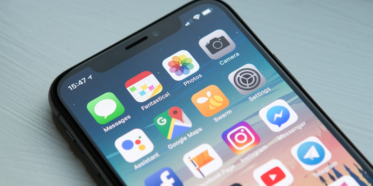
For many browser games, the phone is now the main device. That fact, more than any other single thing, has shaped what the best browser games look and feel like in 2026.
Before touch was the default input, browser game design assumed a mouse with two buttons, a keyboard with WASD/arrow keys, and a screen big enough that you could rest your wrist on it. Those assumptions produced specific game shapes: top-down twin-stick shooters, mouse-aim score-chasers, keyboard-controlled platformers. Some of those shapes still work. Many of them don't.
Touch as the default input produced its own design vocabulary, and that vocabulary now defines what works on the web. This post is a tour of how the shift played out, and what the new vocabulary looks like.
The Two Things Touch Can't Do Well
The most useful way to understand touch-first design is to start with the constraints. Touch is not a worse mouse; it is a different input device with different strengths and weaknesses.
The two things touch struggles with:
Precision pointing. A finger is much wider than a mouse cursor. Aiming at a 12-pixel target with a finger is much harder than aiming at it with a mouse. Games that rely on pixel-precise targeting do not transfer to phones gracefully.
Multiple simultaneous inputs. A mouse and a keyboard can do many things at once: WASD movement, mouse aim, multiple keys for different abilities. A phone with two thumbs can do roughly two things at once, and only if both targets are wide enough that the thumb does not need to be precise.
These two constraints rule out a surprising amount of conventional game design. They rule out twin-stick shooters that require both precise aim and movement. They rule out keyboard-shortcut-heavy strategy games. They rule out anything where the player has to do three things at once.
But constraints generate creativity. Designers who took the touch limitations seriously produced a set of new game shapes that turned out to be better than the desktop versions they replaced.
The Shapes That Won
A non-exhaustive list of design shapes that emerged from the mobile-first era and dominate browser gaming now:
One-button games. The entire game uses a single tap. Examples: Flappy Bird, Geometry Dash, and one-tap reflex games like Orbit Rush. The constraint forces the designer to make the single button feel rich — context-dependent, rhythm-driven, multi-purpose. Done well, a one-button game has more depth than most multi-input games.
Swipe puzzles. A directional swipe is fast, low-precision, and universally understood. Threes and 2048 popularised the pattern in 2014, and a thousand match-three and sliding-tile games refined it. The swipe is the touch equivalent of arrow keys, but it scales to long sessions in a way arrow keys never did.
Drag-and-release physics. Pull back, aim, release. Angry Birds taught a huge audience the gesture. The pattern works because it gives the player precise-feeling control without requiring precision pointing — the dragged trajectory snaps to a continuous range of values, so the player gets feedback on aim without needing to land on a specific pixel.
Tap-timing games. Tap when a moving element aligns with a target. Perfect Stack is a good example. The gameplay is the entire learning curve of fine-grained timing under increasing speed and visual complexity. Works equally well on a phone or a desktop, but was a niche genre before mobile.
Cut-the-rope physics puzzles. Touch to slice, drag to draw, tap to interact. Discrete object interactions, no continuous control needed. The genre would have existed without touch but never would have dominated without it.
Long-press / hold mechanics. A held button can encode duration as a parameter. Cube Jump and most one-tap platformers use this — the longer you hold, the bigger the jump. Crisp on a phone, less natural on a mouse, almost unworkable on a keyboard.
Portrait Orientation Was Not Obvious
One of the biggest surprises in retrospect is that portrait orientation took over.
Pre-mobile, almost every game was landscape (a few arcade cabinets such as Pac-Man and Galaga used vertical monitors). Movies are landscape, monitors are landscape, eyes are arranged horizontally. Landscape feels like the default for moving images.
Mobile flipped that. Phones are held in portrait for everything else — texting, scrolling, reading, watching videos with awkward black bars. Asking someone to rotate their phone before playing a game is a friction point most users never get past. Games that worked in portrait won the audience; games that demanded landscape lost users at the rotation step.
Portrait orientation is a real constraint. You have a tall narrow rectangle to work with. Most pre-existing game design assumes width. The titles that thrived in portrait are the ones that found ways to use the verticality — endless climbers, vertical scrolling shooters, stacked tower games, top-down auto-runners with vertical playfields. The titles that tried to crop a landscape game into portrait look squashed and feel worse.
What a Thumb Has to Do in YoyoArena's Games
The two constraints above, precision and simultaneity, can be read off the touch code of the 23 games in the YoyoArena library. The games were not built to one input standard. As the post on how modern browsers run a game counts, 15 listen for Pointer Events and 13 for raw touch events. The eight that never use Pointer Events were written against touch events, and six of those have a second code path for the mouse. The values below are those at the time of writing.
Twenty-two of the 23 declare touch-action: none in their own CSS, so the browser does not scroll or zoom under a dragging thumb. The exception is Neon Match, which declares only touch-action: manipulation.
Nobody needs a second finger. No game in the library has a gesture that needs two touch points at once, and several lock onto the first one. Brick Breaker and Rollout remember the identifier of the first touch. Gravity Rush, Crater Command and Mini Golf Riot do the same with the pointer ID. The input code of Neon Blaster says it in a comment: only the first touch point is tracked.
Generosity stands in for precision. Beatline Dash divides the screen into thirds: a tap on the left third changes lane to the left, a tap on the right third changes lane to the right, and the middle third dashes. Neon Hook does not read where the finger lands at all. A press hooks the anchor nearest to the player, within 212 units on a canvas 540 units wide. Holding shortens the rope, and letting go releases it.
The small targets. Two of the games described here ask the thumb to hit something specific. In Subway Switch a tap has to land within 38 units of one of three junctions on a canvas 540 units wide, a target about 14 percent of the width across. In Mini Golf Riot a drag has to start within 28 units of the ball on a canvas 480 units wide, about 12 percent of the width.
One hold, three devices. Cube Jump maps a single hold onto a finger, a mouse button and the space bar. Pressing starts a charge and releasing jumps, and the charge fills in 0.8 seconds. Jump force scales from 6 to 14 and forward speed from 4 to 10 with the charge, so a quick tap hops and a full hold flies. Touches that land on a button or menu element are ignored, so a tap on the interface cannot start a jump.
The same drag, opposite signs. Perfect Shot and Mini Golf Riot are both drag-and-release games, and they disagree about what the drag means. In Perfect Shot the shot goes opposite to the drag, like a slingshot, and 160 pixels of pull is full power. In Mini Golf Riot the ball goes the way the finger goes, the pull is capped at 120 units, and a pull shorter than 12 units is ignored, so a stray touch costs no stroke. The "pull back, aim, release" description above fits only the first of the two.
Following a finger and leaning away from it. Brick Breaker and Neon Blaster put the paddle or the ship under the finger by following its horizontal position. Rollout steers by displacement instead: the lean is the distance from where the finger first touched, at 0.008 per pixel for touch and 0.006 for the mouse, up to a full lean of 1. Following the finger puts the thumb on top of what it steers. Steering by displacement keeps the thumb clear of it, and where the finger first lands stops mattering.
A cut is a segment. Rope Snip tests every pair of consecutive pointer samples as a line segment against the rope, so a fast swipe cannot jump over a rope between two samples. Snake reads its swipe when the finger lifts instead, which its own essay covers.
A trade-off the checklist leaves out. Fifteen of the 23 games switch off pinch zoom in their viewport tag with user-scalable=no, and eight leave it on. The records above describe what the code does and not which choice is better.
What This Means for Browser Games Specifically
A browser game in 2026 should assume:
- The input is touch. Mouse and keyboard are courtesy fallbacks, not the primary plan.
- The orientation is portrait, or works equally well in both orientations.
- The hit-targets are large enough to hit with a thumb, on a phone, while walking.
- The game state survives a phone call, a notification interruption, and a screen-off / screen-on cycle without losing progress.
- The first interaction is a tap, not a tutorial.
Browser games that follow these constraints feel native. Browser games that ignore them feel like ports.
The vocabulary of touch design did not just change phone games. It bled into desktop browser games too, because desktop browsers can handle touch input (touchscreen laptops, mouse-as-tap) and because a game that works on both works better than a game that picks a side. The best browser games today are touch-first, mouse-compatible, and indifferent to which input the player picks.
A Note on Bringing Back Desktop-Friendly Design
The pendulum is starting to swing back a little. As browser games re-enter the conversation as a real medium for indie developers (not just casual portals), some of the design space that touch couldn't access — twin-stick shooters, deep-control RPG combat, strategic real-time games — is getting reinvented for the web with appropriate input handling.
This is healthy. The dominance of touch-first design produced a generation of better short games. The next generation will probably include some deeper games again, designed for desktop but playable on phone where it makes sense. The interesting design problem now is not "should we be touch-first or desktop-first" but "how does a single game gracefully scale from a phone played one-handed on a commute to a laptop with mouse and keyboard at a desk."
Most browser games will never need to solve that problem. The single-input, single-orientation design space is plenty rich. But the games that do solve it will be the ones that define what comes after the mobile-first decade — and they are starting to ship now.